Gateway Brand Refresh
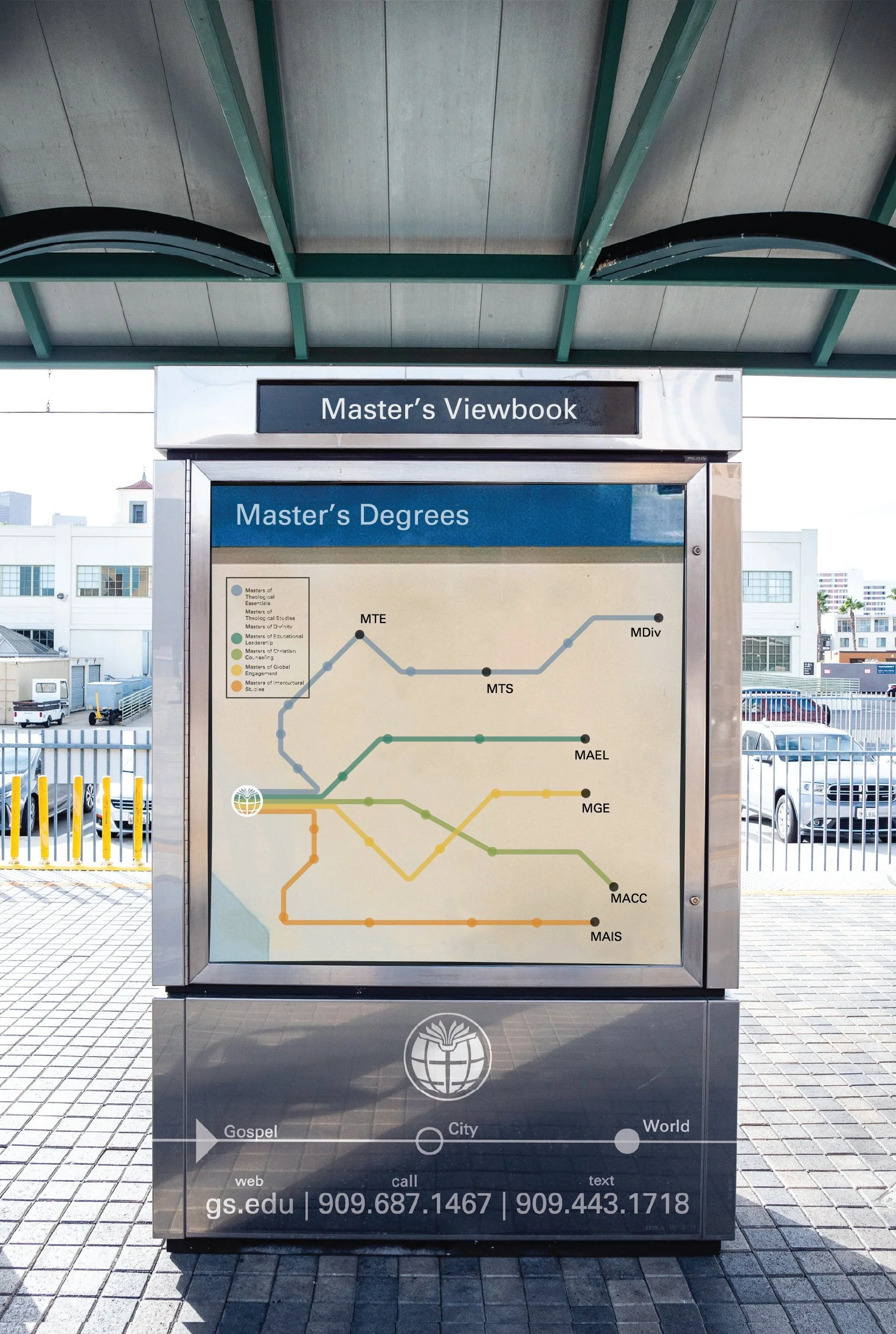
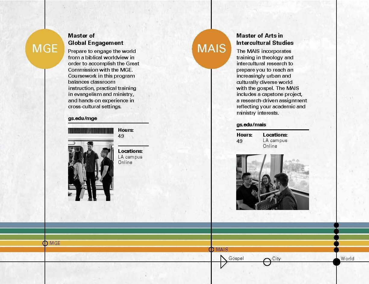
Pioneered the design refresh of Gateway Seminary’s branding tangibles to reflect the urban context of the school and its campuses and align student perception and experience.
The Look
Context/Problem
In 2016, Gateway Seminary relocated its main campus from the San Francisco area with a majority on-campus student body to Southern California with a predominant commuter student community. After becoming a student in 2017, I noticed that most of Gateway’s visual marketing assets did not match my personal experience or the experiences of my classmates. When I joined administrative staff in a creative capacity, I set out to investigate the problem and work towards a solution.
This project proved to be more difficult than I had anticipated. The school had just paid a large sum for a very minimal rebrand and new marketing assets. However, the visual rebrand failed to reflect the drastic culture change and shift of priorities as a result of the relocation. Though the school’s president applauded and commended my Capstone research on utilizing UX/UI research methodologies to create more effective communication and marketing strategies, he was uninterested in supporting additional research-based rebranding efforts because of the school’s recent investment.
Plan/Research
Despite the president’s reluctance, I was given the green light to spearhead a “refresh” of the school’s “look” with great support from many departments. There were both quantitative and qualitative data available to me. The quantitative data showed me the school’s student demographics - the areas it is strong in and also the gaps. The qualitative data was centered around what people inside and outside of our institution thought about the school. First, potential external stakeholders had little knowledge of the school. Second, those who are familiar with the school considered it to be the seminary of the city - a strong distinction from the school’s sister seminaries. Lastly, many found Gateway to be less academically rigorous because its curricula focused heavily on practical experience than academia.
Solutions
From this data, our team decided on three main priorities: 1) to emphasize our market distinction reflective of Gateway’s value of cultural and ethnic diversity; 2) to highlight the school’s rigorous academic programs complemented by hands-on training; and 3) to create a strong visual branding system. I implemented these priorities by first overhauling the school’s visual branding to reflect its identity as the “city seminary” of the west coast and subsequently by producing assets that highlight the faculty’s academic prowess and curricula taught with a global perspective while maintaining the school’s mission of practical training. Additionally, the priority we identified to highlight the school’s rigorous academics promoted a project also included in my portfolio: thegateway.press publishing site.
While this was a freshman attempt at a larger user-driven research, branding and marketing project, the outcome resulted in a more accurate representation of the school and a more appealing visual brand than before. Though our goals were achieved, iterations need to be made to incorporate our expanding and deepening knowledge of our end users and target audiences.
The Tangibles
New visual branding based on UX research, stakeholder interviews, internal goals
New Master’s, Doctoral and General Viewbooks
Informational Cards
Social Media Assets
All new suite of marketing and promotional materials for traveling recruiters
New graphics, redesigned layout and strategy for convention booth


